The Ancient Art of Descriptive Data Analysis
You’ve probably heard at some point that humans are incredibly good at detecting patterns in the environment. And that’s true — for thousands of years, our brains have been making inferences and predictions based on observed data.
To illustrate: Gerald, a Palaeolithic caveperson, has met a sample of wild tigers that have all tried to have him for dinner. Gerald makes an inference about the population of wild tigers and concludes that he should probably steer clear of them in the future.

Go find another snack, buddy!
Data analysis was a matter of life and death for our prehistoric counterparts, and even nowadays it can make the difference between success and failure for a firm. If a company can’t produce goods or services that are 1) relevant to and 2) evolve with consumer tastes over time, it’s only a matter of time before it gets overtaken by its competitors and finds itself with a dwindling revenue stream.
The biggest and most profitable companies aren’t those with the best marketing strategy. They aren’t necessarily those with the most sophisticated, high-end product. They’re the companies that have best collected and leveraged data to inform their strategic decisions and to outmanoeuvre their rivals by staying ahead of the curve with their offerings. It’s hard not to recognise the role and importance of data in modern industry. But what exactly do these companies do with all this data and what are the processes for extracting that all-important, market-beating insight?
The low-down
The details and methods used as part of the analysis depend on its purpose. Perhaps we have a brand new dataset and we want to get a sense of its features; explore potential patterns and trends and find a way of visualising that data that best reveals them. Perhaps we want to try and infer something about a population from a sample that we’ve collected. Or maybe we want to take a set of past observations and somehow extract some information from them that will allow us to better predict the future.
Let’s find out a bit more about these types of data analysis by visiting each of them in turn. In this post, we’ll focus on descriptive data analysis — before following up later on the subjects of inferential and predictive data analysis.
Explaining with an example
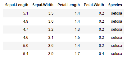
Words can only go so far to explain. Let’s pick a very simple dataset and actually do a descriptive data analysis on it to better illustrate some of the ideas we’re going to talk about. We’ll use a classic dataset containing the measurements of 150 iris flowers belonging to three different species. This data was collected by American botanist Edgar Anderson in 1935. If you want to follow along and try out some analysis of your own, you can download R and load the datasets package to get easy access to this dataset.

In the R console, let’s load the data in and get started with our analysis.
# Load datasets package
library(datasets)

# Display first few rows of iris dataset
head(iris)
Descriptive data analysis aims to present data in a way that exposes its underlying trends and patterns. It’s often the first step in a more complex analysis, and no wonder — if you can’t summarise and understand your data, what business do you have trying to apply more complicated tools?
This kind of analysis usually includes some discussion of:
measures of central tendency. This includes statistics like the mean, median and mode. This can help us get a sense of what the typical or “average” data values are.
measures of spread. Perhaps less obvious than the first; the spread of the data is just as important. With these statistics, we can understand more about the distribution of the data — is it concentrated over a small range or is it spread out? Is it bunched up at either end? Measures of central tendency
Let’s consider the sepal widths in our data. Sepals are the petal-like structures that protect and support the petals of a flower, typically green in colour. What kind of values do sepal widths usually take?
iris$Sepal.Width
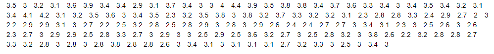
That’s kind of hard to take in — and this is a tiny dataset compared to what we’ll encounter in the future! It looks like the widths range from 2cm to 4cm, but it’s not easy to tell what values are the most common and what the typical value is. Let’s make a plot to visualise the distribution of the sepal widths and plot on the mean value.
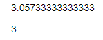
# Calculate mean value of sepal widths
mean(iris$Sepal.Width)

# Calculate median value of sepal widths
median(iris$Sepal.Width)
# Set plot window size
options(repr.plot.width=6, repr.plot.height=4)
# Plot histogram of sepal widths
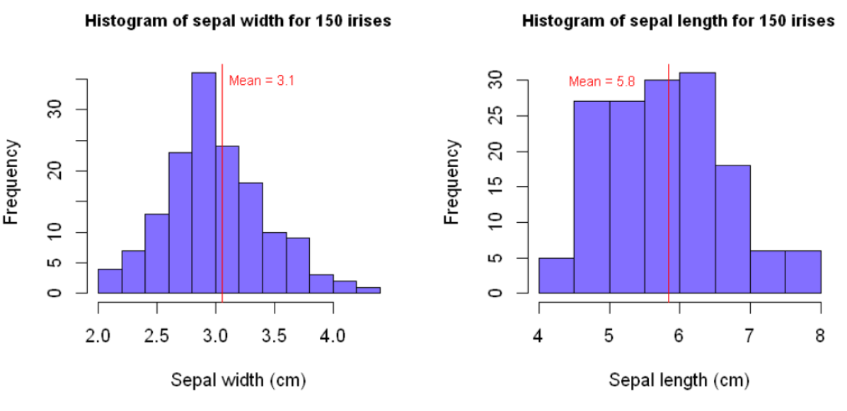
hist(iris$Sepal.Width, main="Histogram of sepal width for 150 irises",
col="slateblue1", xlab="Sepal width (cm)")
# Plot a vertical line at the mean value
abline(v=mean(iris$Sepal.Width), col="red")
# Label the mean value line
text(3.35,35,"Mean = 3.06",col="red")

They say a picture is worth a thousand words and it’s doubly true for data.
- The mean value is 3.1 cm;
- the median (middle) value is 3.0 cm; and
- we can see that the modal range of values (the most commonly observed values) is between 2.8 cm and 3.0 cm.
The histogram also helps us put these measures of central tendency into the context of the rest of the values.
But there’s a limited amount that these numbers can tell us about the shape of the rest of the distribution. We can see from the histogram above that sepal widths take a range of different values. How can we quantify how spread out the data is, or how much it varies around the average value? Measures of spread
We typically quantify how spread out data is around its average value by using the standard deviation (or the variance, which is simply the square of the standard deviation). The standard deviation is large when the data is spread over a wide range of values and is small when the data is concentrated over a narrow range. What’s large and what’s small? That’s a good question — it’s only really possible to interpret the standard deviation when comparing it to that of another distribution.
# Set plot window size
options(repr.plot.width=8, repr.plot.height=4)

# Set up plot area for two side-by-side histograms
par(mfrow=c(1,2))

### HISTOGRAM 1

# Plot histogram of sepal widths, as before
hist(iris$Sepal.Width, main="Histogram of sepal width for 150 irises",
     col="slateblue1", xlab="Sepal width (cm)", cex.main=0.9)

abline(v=mean(iris$Sepal.Width), col="red")text(3.4,35,"Mean = 3.9",col="red", cex=0.75)

### HISTOGRAM 2

# Plot histogram of sepal lengths
hist(iris$Sepal.Length, main="Histogram of sepal length for 150 irises",
     col="slateblue1", xlab="Sepal length (cm)", cex.main=0.9)

abline(v=mean(iris$Sepal.Length), col="red")

text(4.9,30,"Mean = 5.8",col="red", cex=0.75)
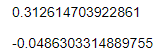
sd(iris$Sepal.Width)
sd(iris$Sepal.Length)
We can judge by eye that the distribution of our sepal lengths is more spread out than that of our sepal widths — looking at the x-axes, the sepal lengths vary over a range of about 4 cm whereas the sepal widths vary over a range of around 2 cm. Calculating the standard deviations allows us to quantify this difference more precisely — the standard deviation of our sepal lengths is roughly twice that of our sepal widths.
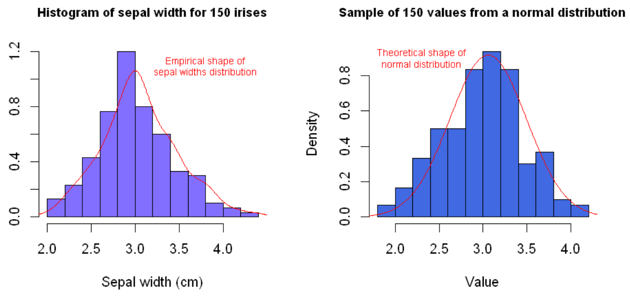
Another important measure of spread is the skew of a distribution. The skew is a measure of how asymmetrically data is distributed. Most people are familiar with the normal distribution — the symmetric, bell-shaped curve that is found in many natural distributions such as those for height, weight, shoe size, IQ, etc. The normal distribution is significant in this discussion because it has no skew — it’s symmetric and its mean, median and mode are all equal. It’s often useful to visually compare a new distribution of data to the normal distribution and to calculate its skew. This helps us identify whether we have an increased likelihood of observing either extremely high or low values on either side of the average value.
# Set plot window size
options(repr.plot.width=8, repr.plot.height=4)

# Set up plot area for two side-by-side histograms
par(mfrow=c(1,2))

### HISTOGRAM 1

# Plot histogram of sepal widths, as before
hist(iris$Sepal.Width, main="Histogram of sepal width for 150 irises",
     col="slateblue1", xlab="Sepal width (cm)", cex.main=0.9, prob=TRUE)

# Plot empirical distribution of sepal widths
lines(density(iris$Sepal.Width), col="red")

# Label empirical distribution
text(3.8,01.1,"Empirical shape of\nsepal widths distribution",col="red", cex=0.70)

### HISTOGRAM 2

# Initialise random seed for reproducibility
set.seed(2021)

# Take 150 sample values from a normal distribution with the same mean and standard deviation as the
# distribution of sepal widths
normal_sample <- rnorm(150, mean(iris$Sepal.Width), sd(iris$Sepal.Width))

# Plot histogram of simulated values
hist(normal_sample, main="Sample of 150 values from a normal distribution",
 cex.main=0.75, col="royalblue", prob=TRUE, cex.main=0.9)

# Add a line showing theoretical density of normal distribution
xs <- seq(1.5,4.5,0.01)
lines(xs,dnorm(xs,mean(iris$Sepal.Width), sd(iris$Sepal.Width)), col="red")

# Label theoretical normal distribution density line
text(2.3,0.9,"Theoretical shape of\nnormal distribution",col="red", cex=0.70)
# Calculate skew of each distribution
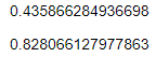
coeff_skew_sepal_widths <- (sum((iris$Sepal.Width — mean(iris$Sepal.Width))**3) / length(iris$Sepal.Width)) / sd(iris$Sepal.Width)**3
coeff_skew_normal_samples <- (sum((normal_sample — mean(normal_sample))**3) / length(normal_sample)) / sd(normal_sample)**3
# Use skews to calculate coefficients of skewness
coeff_skew_sepal_widths
coeff_skew_normal_samples
R doesn’t have a built-in function for calculating the skewness of a distribution, so we’ve had to rely on the mathematical definition — don’t worry too much about these formulae here if that’s not your cup of tea. The thing to note is that the coefficient of skewness for the sepal widths is greater than zero, which is indicative of positive skew. This means we are more likely to observe extreme high values than we would for a symmetric normal distribution. For comparison, we’ve also calculated the coefficient of skewness for a sample of 150 values from a normal distribution. The value is close to zero as we would expect. Stepping back from the details
As we conclude, let’s take a moment to consider the real-world context of a descriptive data analysis. While it’s all well and good that we can understand what all the numbers mean, it’s instructive to note that the data analyst is unlikely to be the one making strategic decisions in a real-world business scenario. More likely is it that the analyst will be reporting to stakeholders, such as managers and heads of departments. These stakeholders may have limited technical knowledge to understand the ins and outs of the analysis, or perhaps limited interest in the details. We should be prepared to explain if necessary, but more important to them usually is the big picture, the “so-what”, the insights and the potential actions available to them. Finding the best way to communicate the features and significance of a dataset can be one of the most challenging parts of the data analysis process — but certainly one of the most important, and one of the most rewarding.
This leads on to one of the most important parts of descriptive data analysis: visualising the data in such a way so as to reveal its true nature and exposing patterns and trends in a way that is intuitive and understandable — even for a non-technical audience. Data Visualisation is a field in itself. An expertly-crafted graphic can communicate ideas, patterns and trends infinitely better than mere words. For some examples of top-quality visualisation, check out some of the work by FlowingData and FiveThirtyEight among others.
So what?
Decisions without data to back them up aren’t decisions — they’re guesses. A speculator may have a good run once in a while, but the player that has combed through and analysed the data they have available to them with the right techniques will be able to back up their choices with evidence and win more consistently. Long-term value is created by businesses that have solid processes in place for data collection and analysis. Companies with departments that communicate and collaborate to leverage all the insight they can from data will perform better and ultimately create better outcomes for stakeholders and for wider society. A descriptive data analysis is the start of the process through which that happens.
Stay tuned for more content on data analysis. Until next time!
More info and credits
Andrew Hetherington is an actuary and data enthusiast working in London, UK. All views are Andrew’s own and not those of his employer.
- Connect with me on LinkedIn.
- See what I’m tinkering with on GitHub.
- The notebook used to produce the work in this article can be found here.
Images: Tiger photo by Boris Drobnič. Iris photo by Olga Mandel. Both on Unsplash.
All plots and code outputs were created by the author using R and RStudio.
Source for Iris dataset: Anderson, 1936; Fisher, 1936