Insight Is Everywhere

Data Science is not reserved for those people who have formally trained in it. Anyone with the motivation can hop on their laptop and start digging, investigating, and visualising.
They can get started on the data they have lying around. And boy, do we have it lying around — often in very large quantities. In our jobs and in our lives, we are constantly chucking out data — and although the quality of it varies from source to source, I will not believe you if you tell me that there’s nothing of value that can be drawn out from the data you have access to. I want to demonstrate that it is fully possible to gain insight even from simple data sources that you may initially overlook.
So what’s the deal?
In certain sectors, such as finance, there is typically no shortage of numerical data to analyse — but I appreciate that this may not be the case in other industries. So, to show that these principles apply more generally in other types of organisation, we’re going to forgo the numbers and investigate a rather generic data file.
For those who are keen to understand how the data has been processed, you can follow along in the Jupyter Notebook I’ve uploaded to GitHub. Python was used for this analysis. Numpy and Pandas were used for data manipulation and calculations. All plots were produced using Matplotlib.
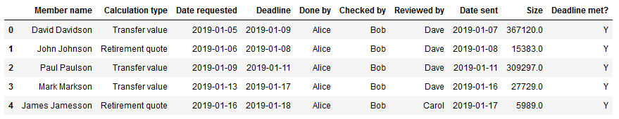
We’re working with Work In Progress (WIP) document, which has been used to record the details of a number of actuarial work items that have been completed since 2019. We have at our disposal:
- Member name: the name of the member for whom the task was completed
- Calculation type: the type of calculation needed
- Date requested: date on which the work was requested
- Deadline: date for which the work was asked to be completed by
- Done by: who performed the work
- Checked by: who checked the work
- Reviewed by: who reviewed and approved the work
- Date sent: date on which the work was finalised and sent out
- Deadline met?: whether the work was completed in time for the deadline, ie whether Date Sent is before or on the same day as Deadline
Once we’ve inspected the data’s integrity and dealt with any erroneous or missing values, we’re ready to begin.
Who’s been doing what?
Say we want to track how much exposure Alice and Bob have been getting to each of the roles in the work process — we want to ensure that they’re both gaining experience and progressing. After some manipulation, we can work out how many cases Alice and Bob have done, checked, and reviewed in each month since the start of 2019:
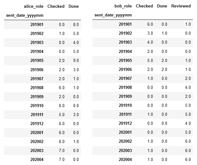
Tables are all well and good, but our brains can’t can really get a grip on tabular data in the same way as a good visualisation. Let’s plot these findings:
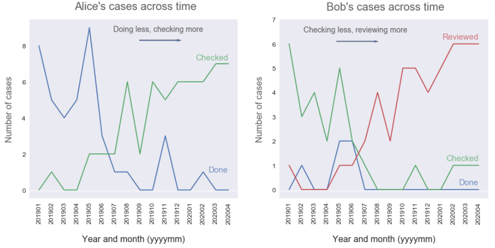
We can see that Alice was initially doing a lot of cases, but has now transitioned into more of a checking role. Similarly, Bob was mainly checking cases at the start of 2019, whereas now he’s reviewing the large majority of cases he’s seeing. Both good indicators that our employees are learning and being challenged!
Have we been meeting deadlines?
We’re likely to have some sort of service level agreement in place to ensure that we’re doing our work quickly enough. Delivering below the agreed level of service will damage our relationships with our clients. We could end up losing business if they end up going to one of our competitors in search of better service. With that in mind, let’s look at whether we’ve been hitting our deadlines lately.
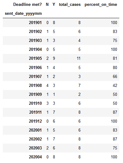
Again, let’s represent the data with a graph:
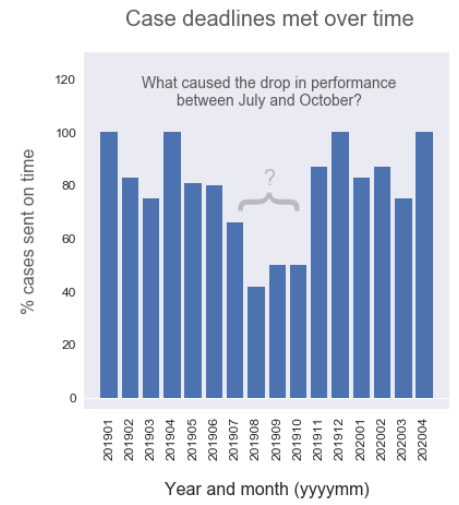
Looks like we generally maintain a service level of delivering between 80% and 100% of cases on time. However, there’s a pretty significant drop in service level from July to October 2019. If we’re not already aware, we’ll want to drill down into why our team wasn’t performing as well and address the issue. Were we understaffed? Was it a particularly busy period? Do we need to hire more permanent or temporary staff to cope?
Sometimes data analysis can generate more questions than it answers — but if they’re the right questions, then we’re moving in the right direction and adding value.
What cases are we missing deadlines for?
Hitting deadlines is important for our team and for our relationship with our clients. Let’s take a look at the kind of cases that are the most problematic when it comes to missed deadlines.
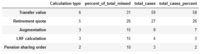
As usual, let’s see if we can plot this data in a way that reveals what’s going on more clearly:
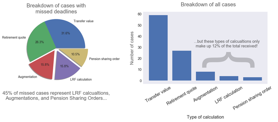
Interesting! There are certain types of calculations that are received relatively infrequently, and yet they make up a large proportion of the total cases for which we miss deadlines. In other words, we’re disproportionately bad at them for whatever reason.
Potential actions could be more on-the-job coaching for the team on how to deal with these cases, or perhaps feeding back to the firm-wide training and development team that these types of calculations need to be covered more thoroughly when onboarding new staff.
Insight is everywhere
Hopefully, this has gone some way to demonstrating that there is almost always something interesting to investigate when it comes to your data. We’ve only scratched the surface of what even this rather basic dataset has to offer. The limiting factor isn’t technology. It isn’t the availability of opportunities to apply data science in a real-world context. It isn’t even knowledge — there are endless resources out there that we can learn from.
The limiting factor is motivation. The learning curve can be difficult to manage at first and we all run into problems along the way. Some of those problems may seem insurmountable and can cause us to throw up our hands in exasperation and frustration. But — the pursuit of solutions to these tough problems is where we develop the most rapidly. And as long as you keep working, those problems can and will be overcome.
You may not think yourself a data scientist, but truly, anyone can learn to apply these tools in their work. So I encourage you — pick up a piece of data that you work with that you think may contain some useful insight. Once you start to explore and play around with it, you will very quickly prove yourself able.
More info and credits
Andrew Hetherington is an actuary and data enthusiast working in London, UK. All views are Andrew’s own and not those of his employer.
- Connect with me on LinkedIn.
- See what I’m tinkering with on GitHub.
- The notebook used to produce the work in this article can be found here.
Images: Telescope photo by S O C I A L . C U T on Unsplash.